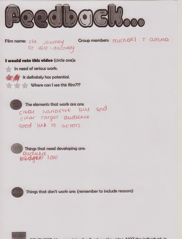
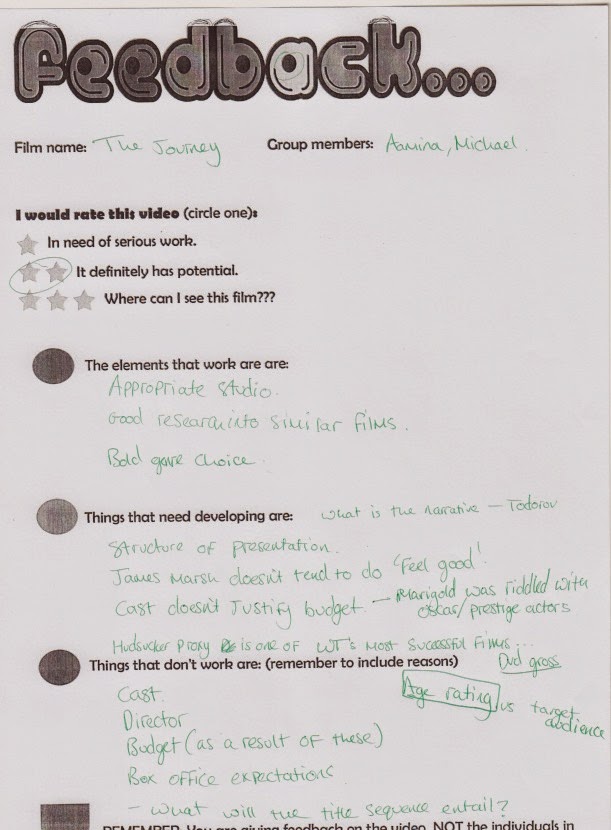
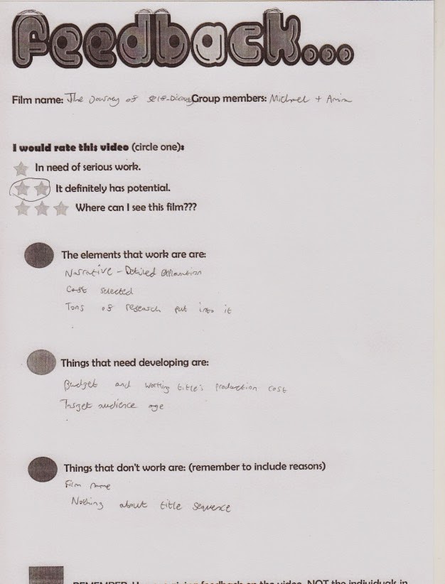
Friday, 30 January 2015

Codes & Conventions of Title Sequences

  • Details of cast and crew

  • ·       The film’s title

  • ·       An introduction to characters/ character type

  • ·       Indication of setting

  • ·       Indication of historical period

  • ·       Information regarding mood and tone

  • ·       Introduction to signature soundtrack

  • ·       Information about genre
  • ·       Questions that the viewer finds intriguing; sets up enigmas

  • ·       Pattern of editing
 
  •      Mise en scene and cinematography

Wednesday, 28 January 2015

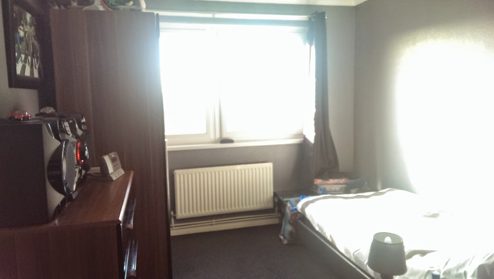
Set for "The Journey of self-discovery" title sequence (PLANNING)

These images below are some of the set where my title sequence will be taking place.
These were the original images of the set we would like to use for our film but we were thinking about maybe changing the set as it doesn't really fit the character of Louise Brown or the story.


Monday, 26 January 2015

Nina Saxon Design analysis


Saul Bass analysis


STINCS for Title Sequence

Setting- London Office Building and Rural India

Theme- Friendship, Human Rights, Politics, Self Discovery

Iconography- London- Skyscrapers, Taxi's, Modern, Grey and dull office wear
                        India-Shack houses, Cultural clothing, Rickshaw's, Not modern

Narrative- Refer to narrative post

Characters- Louise Brown- Main character (woman)
Anita Devar - Indian girl
Matthew King- Louise's love interest
Mike Healy- Louise's manager

Style- Uplifting
Credits planted around the scene
Slow pace

By doing STINCS, this has helped my planning so I can makes sure that I have highlighted all these key points and have included them in my film. I know can make my title sequence better as I know what STINCS I need to add to make it better.

Narrative for The Journey of Self- Discovery

The title for our film is "The Journey of Self-Discovery". We have chosen this film title because it is about Louise's journey from being a boring life-less woman who hates her life to being someone who inspires many young girls to get an education. whilst on this physical journey she discovers that she is not who she was and in fact she is someone who is brave and exciting, thus her self-discovery.

The title sequence for my film will be of feel good drama genre. I am working with Amina Hebouche. We have been heavily influenced by the following films : The Secret Life of Walter Mitty (Ben Stiller, US, 2013), Jerry Maguire (Cameron Crow, US, 1996) and Forrest Gump (Robert Zemeckis, US, 1994)

Louise Brown- Main character (woman)
Age 36
Occupation changes throughout the film. To the beginning she works in offices at the end she is the founder of an organisation.

Anita Devar - Indian girl
Age 11
She originally has no occupation but by the end of the film she is a student at a school

Matthew King- Louise's love interest
Age 39
Occupation as a missionary

Mike Healy- Louise's manager
Age 42
Office Manager

Todorov's theory of narrative

  • Equilibrium -  Louise dislikes her boring office job where she has to do work which she hates and have to put up with sexist comments from her horrible colleagues and managers especially her manager Mike Healy. She has always had dreams of travelling the world and help those who are less fortunate than her by experiencing there cultures and finding herself in the world and not just the office she works in.
  • Disruption of Equilibrium -  She has a mental breakdown at work and was fired. She couldn't afford to pay her rent which was flat shared so her friend evicted her. Louise has nowhere to go so decides to live her dream by travelling the world to get away from her depressing life in London. 
  • Recognition of Disruption - She tries to gather money from her Life Savings and when trying to think about where to go to she finds a leaflet for a charity working in India. This then gives Louise the idea to go to India and help the children. 
  • Attempt to Repair: She travels to India where she manages to find a place to live with a local family. There she bonds with a young Indian girl called Anita who dreams to become a teacher. Louise has an epiphany and she realises that her life is not as bad as others. She helps Anita by helping girls get an education in Anita's village even though the odds are against her. She went to New Delhi to try to convince the government to help her but they say it is against the countries wishes.
  • New Equilibrium - After several months, Louise managed to achieve what she wanted by persuading the Indian government to let girls in Anita's villages have an education so that Anita can try to become a teacher. Louise becomes the founder of a organisation which helps girls in India get an education. Louise meets a missionary in India and they start a relationship together.
Propp's character theory

  • The villain - Mike Healy
  • The helper - Anita Devar
  • The prince - Matthew King
  • The hero - Louise Brown

Sunday, 25 January 2015

Planning sheet


The Game title sequence analysis

I can make presumptions from watching The Game’s title sequence that it is of the genre drama mystery thriller. The sequence shows what seems like home video clips of a birthday party for a boy. The sequence also regularly cuts to a short video of a boy with his father. The sequence is done in a way that it creates mise-en-scene of a thriller with nostalgia that creates an eerie and spooky atmosphere.

Richard ‘Dr’ Baily created the title sequence. He had worked on many films including Fight Club and Superman Returns. When creating this title sequence Baily had to think about typography, soundtrack, iconography and mise-en-scene to create a successful piece of work.

The typography in this sequence is a white serif font. The typography is only featured during the puzzle piece part of the title sequence. This was done to put all attention on what was happening in the home videos part of the sequence. The font is in bold showing the importance of the text. The font colour is white because of binary oppositions, Black vs White. This could suggest Good vs Bad. The typography is also placed in the sequence to make it seem as if it was part of the puzzle. This maybe suggesting that the film is a puzzle waiting to be cracked. This is accompanied by a subtle smashing of glass, this could suggest that something is being smashed or cracked in the film.

The soundtrack for the sequence is by Howard Shore who is a renowned conductor famous for the scores for The Lord of the Rings trilogy. Baily probably chose Shore because he had previously written the score to Se7en which was a major success. In the sequence we can hear a piano playing softly with a sense of nostalgia to it. The piano though does have a sense of uneasiness and eeriness to it. It has a dark tone to it which is gentling yet suspicious.

The iconography in the clip shows things about the film and the characters in the clip. We see the puzzle pieces that transition between the cast and crew. This could represent many things. It could suggest that there is an enigma to the story that we as an audience must work out. This enigma would be the basis to the nostalgic clips. It could also suggest that a character in it has had a complicated life because a puzzle is complicated. This could be the boy we see at his birthday party. He may have secrets that we need to work out. It could suggest that there is a ‘puzzle piece’ of his life missing that he needs to find to settle things that had happened before in his life. This puzzle sequence was described by Fincher (Director or The Game) as “an elegant introduction to who the character is”.

The mise-en-scene is in the clip shows us that the boy’s family is wealthy because of the elegant setting and the sophisticated party that we see in the nostalgic footage. We regularly see the boy’s father in the sequence. This could be of importance in the clip. We see regularly cuts to mid-shots of the boy and his father together who seem as if they are having fun. This could represent a close and good relationship. Although at the end of the clip we see he boys father walk towards the darkness, this could connote a disappearance of the father in the boy’s life and possibly death.


As we delve deeper into the clip we can notice that there seem to be several shots where water plays a key part in the sequence this could represent a theme of water. There is a shot of a boy being pushed into a pool, the birthday boy holding a toy yacht with his father, a shot of a remote controlled boat in water and a final shot of the man splashing water in his face over a sink. This makes a subtle hint to the audience that that man is the birthday boy in the home videos. Whereas in the scene’s before the boy is happy and laughing in this scene he appears to be depressed and unhappy, showing something bad has happened in his life to make him feel this way.
Saturday, 24 January 2015

Zombieland title sequence analysis

I can make presumptions from watching the title sequence to Zombieland that it is a zombie horror/comedy. I can come to this conclusion because of use of blood and zombies but also for comedy the use of hidden humour in what the characters are doing. As an audience whilst watching this clip we are supposed to feel worried about the zombies and what they are saying but because of the genre comedy we are supposed to laugh at the situations that are happening in the sequence.

Ben Conrad designed the title sequence. He has worked on other films as creative lead such as Captain America: The Winter Soldier. When creating this title sequence Conrad had to think about typography, soundtrack, iconography and mise-en-scene to create a successful piece of work.

Typography is an important part of a title sequence because if the typography for your title sequence looked dark and gloomy it would not suit a light comedy. The typography in this clip is bold and sans serif. The font looks similar to many action hero movies especially super hero movies. This could be a technique that Conrad has used to make the film appear to be similar to a super hero movie yet slightly different. The colour of the typography is predominantly red. This colour connotes blood and death but also is a colour represented by superhero’s such as Spiderman and Ironman. The iconography has been placed as it molds into the scene.


The soundtrack was by Metallica. They are a very successful heavy metal band who have made many songs since they began in 1981.Their strong sounding fast pace songs are perfect for a zombie horror film. It accomplices the title sequence well with its dark tones. The director instead of the title sequence designer chose the song, which is unusual.

The iconographic features in the clip are important to create this fast pace effect. The use of zombies with blood spurting in the screen and destruction has an apocalyptic effect to the film.The fire and smoke suggests that this is on large scale. The use of long shots turning into close-ups makes the audience feel as if they are in the film themselves. The structure of the title sequence shows action in different places to suggest that this is happening everywhere. The opening shot being with what we presume the President of US car shows the audience that what is happening is effecting everyone, even The President of US.


Se7en title sequence analysis

I can make presumptions from watching the title sequence to Se7en that it is a psychological thriller. I can come to this conclusion because of the use of the dark colours, blades and using sharp objects. These are all iconographic symbols for psychological thrillers.As an audience whilst watching this clip we are supposed to feel intrigued into what is happening as we are not told anything in the clip about what is happening. This adds to the feeling of mystery and creates a sort of enigma in the title sequence.

Kyle Cooper designed the title sequence. He is a renowned title sequence designer and Se7en is one of his most famous designed title sequences. When creating this title sequence Cooper had to think about typography, soundtrack, iconography and mise-en-scene to create a successful piece of work. 

Typography is an important part of a title sequence because if the typography for your title sequence looked artistic and flowery it would not suit a dark psychological thriller. We experience two examples of typography is this sequence. The first being the jagged hand-drawn lettering for the names of the cast and crew and the other being the sans serif block style lettering for the jobs of the cast and crew and titles. The sans serif style lettering could suggest law such as the police but the jagged hand-drawn lettering could suggest crime. This is called binary opposition. The typography overall fits with the mysterious mise-en-scene of the clip as we do not know nothing about who or what is happening in the clip so we make guesses towards what we think is happening, The colour of the typography also indicates a binary opposition as the font is white and the background is black this could once again suggest law vs crime.

 The soundtrack was by Trent Razor. He is part of a rock band called ‘Nine Inch Nails’. His rock tone and the song that he sings for the title sequence was probably chosen because it suits well with the dark and eerie atmosphere which is coming across in the sequence. The song appears to be of Christian music origin as it references god and the bible several times. Once researched Trent Razor, I know he had collaborated with Kyle Cooper before so that may have been a reason cooper chose him to sing in the title sequence. The soundtrack seems to appear to get faster paced as tension builds in the title sequence. There is a slight sound of what seems like a typewriter in the background, this may reference to something in the film.


The iconographic features in the clip are important to create this chilling effect. The use of razor blades and sewing needles suggests pain and torture to the body. The scissors are meant to show blades when he cuts the film. When he draws over the image of the persons eyes, this could suggests the disfiguration of the eyes in a future part of the film. These all could connote death or body horror. The title sequence has been edited in a way to appear freighting by making the video footage appear jumpy by using many cuts and fades. The fades create the effect of insanity of the mysterious man.

Friday, 9 January 2015

Genre case study

Eat Pray Love (2010)
  • Liz Gilbert (Roberts) had everything a modern woman is supposed to dream of having - a husband, a house, a successful career - yet like so many others, she found herself lost, confused, and searching for what she really wanted in life. Newly divorced and at a crossroads, Gilbert steps out of her comfort zone, risking everything to change her life, embarking on a journey around the world that becomes a quest for self-discovery. In her travels, she discovers the true pleasure of nourishment by eating in Italy; the power of prayer in India, and, finally and unexpectedly, the inner peace and balance of true love in Bali. 

  • I like the title sequence as it fits well with the opposed title sequence as it is in a exotic Asian location similar to India. It also features one women as the man actress which is very similar to my title sequence. It goes well with the feel good drama genre with the iconography and mise-en-scene involved. Liz's appearance is basic and pure which connotes simplicity similar to Louise in my title sequence. The waves and natural landscape reflects the beauty of the area with the beauty of the character.

  • The typography is the sequence is white against a black screen. The colour white has connotations of beauty and simplicity. It is a serif font with curlicue's on the end of the letters, this is typical for a feel good drama genre title sequence and text.

  • The soundtrack is uplifting and calm which goes well with what we see on the screen. It is an orchestral sounding soundtrack with soft touches to it yet it fluctuates with the tone of the piece.

Thursday, 8 January 2015

Genre case study

Forrest Gump (1994)
  • Forrest Gump is a simple man with a low I.Q. but good intentions. He is running through childhood with his best and only friend Jenny. His 'mama' teaches him the ways of life and leaves him to choose his destiny. Forrest joins the army for service in Vietnam, finding new friends called Dan and Bubba, he wins medals, creates a famous shrimp fishing fleet, inspires people to jog, starts a Ping-Pong craze, create the smiley, write bumper stickers and songs, donating to people and meeting the president several times. However, this is all irrelevant to Forrest who can only think of his childhood sweetheart Jenny Curran. Who has messed up her life. Although in the end all he wants to prove is that anyone can love anyone.

  • I like the title sequence to his film as I think it is very gentle in he way that it welcomes you to the film with very calming soundtrack and focuses on a feather to show the simpleness and peace that a feather connotes. This I believe is very similar to the feel good genre which I want to base my title sequence on. I believe that the title sequence reflects the story because the title sequence connotes purity and calm and the film is about Forrest Gump who is a calm and pure person who experiences everything in life.

  • The typography of the title sequence is quite plain. It has curlicue's on the words but its very simple and pure once again reflecting the genre of the film and the subject of the film. It is in the colour white just like the feather.

  • The soundtrack of the title sequence is very calm without any parts which become louder or stronger. This is because of the typography and clip which is also calm and simple. This helps to create this feel good drama genre. 


Wednesday, 7 January 2015

Genre Case Study

My idea for a genre for the title sequence piece is feel good drama. I wanted to do this genre because I feel that I can create a good title sequence after watching many films that are similar to this genre.

The Secret Life Of Walter Mitty (2013)
  • The manager of the negative assets sector of Life magazine, Walter Mitty, has been working for sixteen years for the magazine and has a tedious life, not going anywhere but from his home to his job and vice-versa. He is an escapist, daydreaming into a world of fantasy many times a day. Walter has a crush on the recently hired Cheryl Melhoff but he is too shy to invite her on a date and he is trying to contact her via online dating. The magazine is preparing to release its last printed edition and the loathsome manager of transition Ted Hendricks is preparing an inevitable downsizing over the next few days.
  • Walter has been the liaison between the magazine and the mysterious independent photographer Sean O'Connell who has sent to him a package of negatives and a wallet as a gift for his work. Sean also suggests to the senior management the use of negative 25 for the cover of the last edition. However, Walter cannot find the negative that is missing. Walter has no means to contact Sean and finds a clue that he might be in Greenland. He decides to travel to Greenland to track Sean down in the beginning of an unbelievable adventure.

  • I like the title sequence to this film as it shows an insight into the life of Walter Mitty. It is very uplifting and light. The title sequence features few dialogue yet it is effective. The soundtrack suits the iconographic features well. I also like, which I hope to add to my title sequence, the way the film uses the set to make the names of the cast and crew appear around them. The title sequence suits the genre and storyline of the film because it tracks Walter Mitty and shows the audience that his life is very normal and basic. It also suits the feel good drama genre because it shows how normal life is and is very simple not telling the audience too much.

  • The typography is quite bold yet basic without curlicue's. It shows normality without any frills. It blends with the scene to make it more interesting.

  • The soundtrack is upbeat and matches with what happens in the clip.